Introduction
 Welcome to the website of the St. John the Baptist Cathedral in Canberra.
The cathedral parish is part of the Australian Diocese
of the
Russian Orthodox Church (Abroad). We hope that your visit will be of benefit.
Welcome to the website of the St. John the Baptist Cathedral in Canberra.
The cathedral parish is part of the Australian Diocese
of the
Russian Orthodox Church (Abroad). We hope that your visit will be of benefit.
The dean of the cathedral is Archpriest Alexander Morozow.
For general enquiries please email enquiry@stjohnthebaptist.org.au. For information and enquiries about hiring the parish hall, please see the contact page.
Our parish website also has web pages in Russian with different content.
To help us overcome the financial impact that the pandemic has had on our finances, we ask you to consider a regular monthly financial contribution to our parish. Contributions directly into our parish bank account is the easiest way to make your donation. Our bank account details are as follows:
BSB: 032719
Account: 602930
Other updates for the parish community and communications from the parish clergy will be published here. Please check back regularly.
Schedule of Upcoming Services
| Saturday 6 June | 5:00 pm | All Night Vigil | 1st Sunday after Pentecost All Saints |
| Sunday 7 June | 9:00 am | Divine Liturgy | |
| Saturday 13 June | 5:00 pm | All Night Vigil | 2nd Sunday after Pentecost All Saints of Russia |
| Sunday 14 June | 9:00 am | Divine Liturgy |
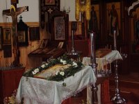
Services
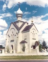
Visitors are always welcome at our services. The All Night Vigil is celebrated beginning at 5 PM on Saturday evenings and the Divine Liturgy at 9 AM on Sunday mornings. Confessions are heard during the Vigil service. The principal language of the services is Church Slavonic. Some English is used in the Divine Liturgies and usually somewhat more during the All Night Vigils. The parish church is located at:
1 Matina St
Narrabundah ACT 2604 (map)
For updates to the service schedule and other parish events, follow us on Facebook.
Parish Life
Our behaviour During Services… Read on…
Parish Membership
We would encourage those who attend our services and are part of the Orthodox community in Canberra to become parish members. An explanation of the importance of parish membership is available in Russian and English, as is a parish membership form, also in Russian and English.
Information is available about how members of our community can help to support our parish financially, when unable to attend weekly services.